
Gallery Wall Ideas: 4 Stunning Layouts for Any Room
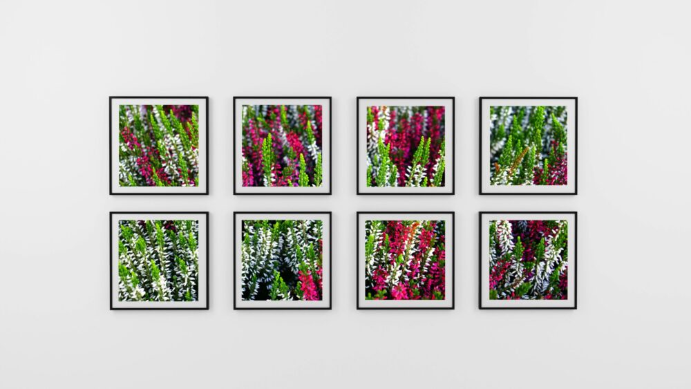
Many homeowners admire homes with beautifully arranged walls but feel stuck when facing their own blank spaces. The pile of frames on the floor, the uncertainty of where to begin—it’s a common decorating dilemma. The challenge often lies in finding a layout that tells a personal story and makes a space feel complete. Fortunately, creating a beautiful gallery wall is more about thoughtful planning than a large budget.
The secret to a lovely display lies in choosing an approach that suits the specific room and the homeowner’s collection. Whether it’s for a small apartment, a rental with restrictions, or a home with a growing collection of memories, there is a gallery wall layout that will bring the space to life.
The Classic Grid Layout
For those new to gallery walls or who prefer clean, organized spaces, the grid layout is an excellent starting point. Decorators often recommend this approach for people who feel overwhelmed by more eclectic arrangements because it removes the guesswork from placement.
Perfect Spacing Techniques for Rental-Friendly Walls
The key to a professional-looking grid is consistent spacing. A common pitfall is creating uneven gaps, which can make the entire arrangement look off-balance. Professional designers suggest measuring 2-3 inches between each frame, both horizontally and vertically.
For renters concerned about multiple nail holes, a useful technique is to use removable adhesive strips rated for the frame’s weight. Another option is creating a paper template first. By cutting paper rectangles the same size as the frames and taping them to the wall, homeowners can live with the arrangement for a few days before committing to any holes.
Choosing Frame Sizes That Work Together
For a true grid effect, it’s best to stick to one or two frame sizes. Most decorators find that 8×10 frames work beautifully for many spaces, while 5×7 frames are well-suited for smaller walls or when displaying more pieces. A common mistake is mixing too many sizes in a grid, as it can detract from the clean, organized look.
Color Coordination Without Overwhelming Your Space
It’s helpful to choose frames in the same color family, even if they’re not identical. Picture this space: a dining room grid with all black frames, where some are matte and others have a slight sheen. This creates subtle visual interest without breaking the cohesive feel. For the artwork itself, limiting the color palette to 3-4 main colors that complement the room’s existing scheme is a sound approach.
The Salon-Style Eclectic Mix
Grand European salons with art covering every inch of wall space are the inspiration behind this approach. It is perfect for maximizing visual impact in smaller spaces or when a large collection needs a home.
Layering Different Art Mediums Successfully
The beauty of salon-style walls lies in their intentional chaos. Mix photography with paintings, prints with textiles, and small pieces with larger ones. Consider a home office with a stunning salon wall that includes vintage postcards, family photos, small oil paintings, and even a decorative mirror. The key is ensuring each piece relates to the others through color, theme, or personal meaning.
Creating Visual Balance with Varied Frame Styles
While frame styles can be mixed in salon arrangements, maintaining some consistency helps to avoid visual chaos. Decorators often suggest choosing frames within the same color family but varying the materials—think black wood, black metal, and matte black plastic all working together. This creates enough variety to keep things interesting while maintaining cohesion.
Working Around Existing Furniture and Fixtures
Salon walls work beautifully around obstacles like light switches, outlets, or built-in shelving. Instead of seeing these as limitations, they can be used as anchors for the arrangement. Some of the most character-filled gallery walls are built around a thermostat or work with an awkwardly placed sconce, as these “imperfections” often add personality to the final result.
The Linear Horizontal Display
Long, narrow walls can be tricky to decorate, but a horizontal linear arrangement turns these challenging spaces into stunning focal points. This layout works particularly well in hallways, above sofas, or in any space where the goal is to emphasize width rather than height.
Making Narrow Hallways Feel More Spacious
Horizontal arrangements naturally draw the eye along the wall, making narrow spaces feel wider. For example, in a cramped hallway, a horizontal line of five smaller frames can make the space feel more proportional than one large piece that might emphasize the area’s narrowness.
Choose pieces that are similar in height but can vary in width. Framing them identically creates maximum impact, and keeping the spacing consistent—about 2-4 inches between frames—works well depending on the wall length.
Coordinating with Low Furniture Pieces
Linear arrangements work beautifully above low furniture like sofas, dressers, or console tables. The key is ensuring the gallery wall is proportional to the furniture below. A good rule of thumb: the arrangement should be about two-thirds the width of the furniture piece it’s hanging above.
Picture a tiny trio of photos above a large sectional sofa—it can look completely out of proportion. Expanding the arrangement to include seven pieces spanning most of the sofa’s width makes the whole room feel more balanced.
Maintaining Visual Flow in Open Floor Plans
In open-concept homes, horizontal gallery walls can help define different areas while maintaining visual flow between spaces. Using similar framing and color schemes throughout the linear arrangements in different areas creates cohesion without making the space feel choppy.
The Statement Corner Arrangement
Corners are often overlooked in home decorating, but they offer unique opportunities for creating intimate gallery spaces. Corner arrangements work particularly well in bedrooms, reading nooks, or any space where the goal is to create a cozy, personal atmosphere.
The key to successful corner galleries is working with the natural sight lines of the space. People don’t typically stand directly in front of corners, so the arrangement needs to look good from multiple angles. A successful approach is to create L-shaped arrangements that follow the corner’s natural lines, or to focus on one wall while letting a few pieces wrap around to the adjacent wall.
Start with the largest or most eye-catching piece positioned where it will be most visible from the room’s main entrance. Then build the arrangement outward, keeping in mind that corner lighting is often softer and more intimate than center-wall lighting.
*This is a collaborative post